I overlooked ambient lighting calculation in the scene.environment.sun update which makes for some nice early morning flights. It's looking more like it should now. Pretties are not my priority, polishing happens towards the back end of the project but with the model show in Italy coming up it's time to fix up some outstanding issues.
Here's a bunch of assorted screen-shots for the team to inspect the results.
*update*
As a little experiment I added Aily's edge sharpen filter to the MTADS image post-processor, this makes objects stick out from the background better. I'll either replace this or augment it with the light amplification frag shader from last year.
The 'MPD' glass wasn't working, it was receiving shadows and ambient light which greatly reduces the backing image. I've disable the MPD reflective glass material (for now) using the invisible.frag shader.
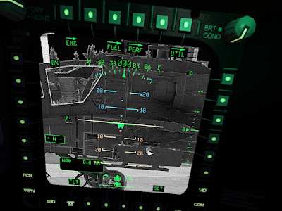 |
| It picks out the rivets well. |
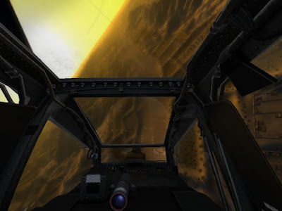 |
| Need to correct cockpit lighting here |
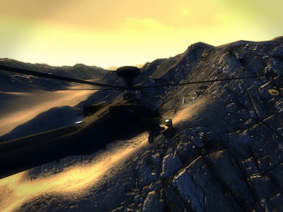 |
| Normal maps stand out a bit better. |
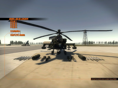 |
| It comes in non Longbow flavour |
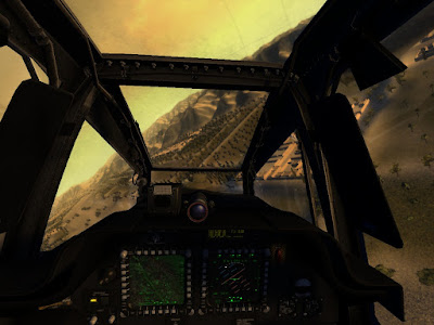 |
| cockpit lighting correction, compare above |
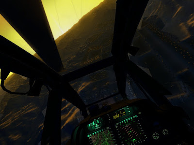 |
| another ambient correction on cockpit |
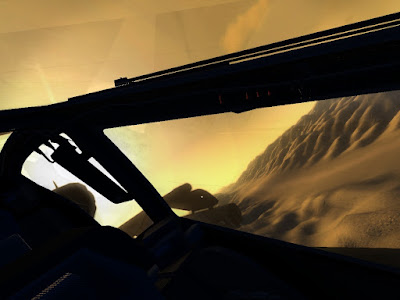 |
| cpg over the shoulder view |
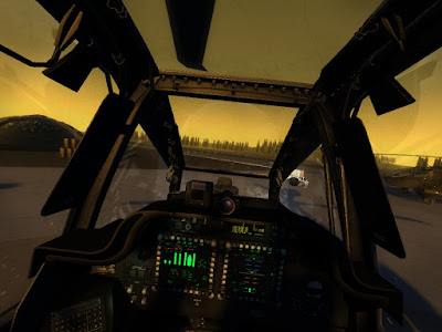 |
| All lighting and shadows are real-time |
It's not all brown, just the time of day and map I selected for most of the shots.
Also managed to spend more time on entity damage, since we don't yet have a destructible object database, if the object doesn't have any armour data the 'hit points' for want of a better term are based on the AABB volume. Just a quick fix to add default data.
It's most satisfying to blow things up although were short on pyrotechnics. Flash bang is all we have.


These screens.... hats off,Are you a world-class artists,full respect for the whole team.
ReplyDeleteToday i remove all old simulators from disk, I can not look on them, and wait for the release CH.
I can't imagine how few people can do such game.
I do not understand only one-everywhere you write-CH May worse graphics than the DCS and AAA,
Ch no comparisons to the A-AA and DCS, and the screenshots you can see that this game looks better than these two games together
Unnecessary modesty;)
And as Dave will remind me, we're after recreating the feel of old Janes sims with more modern lighting and a few frills. That we have achieved above and beyond I think.
ReplyDeleteAs the art department I suppose I should say something.
ReplyDeleteI'm extremely happy with the graphical quality. Almost all of the artwork is uniform in tone and style which is where so many small teams stuff up. It's all fairly high-res with very reasonable poly-counts.
I'm very pleased with the quantity too. In a year we've built far more assets than could reasonably be expected. Going from LOMAC -> DCS:BS was arguably 1/5th as much of an art challenge as going from literally nothing to where CH is today.
Ok, none of the art is super flash like you might see in a first person shooter. There's no 250,000 poly models A la FSX. DCS:BS, aside the art is as good-as or better-than the art in any other Heli combat sim out there. It looks a world ahead of the original Combat Helo experiment which itself looked a giant leap ahead of LB2.
We've done some graphical stuff in just over a year that similar sized sim developers haven't managed in 10 years (A plausible city, true 3d buildings, true 3d trees, roads, fully clickable 360 degree cockpit, twin seat, dynamic reflections, panel back-lighting, vehicles that don't look like stacked cereal boxes, friggin inventory items).
Thanks to some nifty optimizations in both code and assets it all runs at some extremely tasty frame rates (I was getting 100+ fps flying over the range today). DCS can't even hit 1/3rd of that.
The big graphical fuglies (floating point nasties, no distance shadows, 5 terrain paint layers, ever-tiling ground textures, slow veg load times etc) are all code issues that are inherited from the engine and are out of our hands.
If people want to complain about the terrain they can jog on over to the leadwerks forum and complain over there.
Cheers
I'm just a humble player,who knows all simulators from the beginning pc,And here i am surprised every day with new great ideas, graphics,and i see the same things that i wanted to see and do in my helicopter simulator.
ReplyDeleteGraphics already at this level is, about which not even dreamed that I would see in the simulator.
You are professionals, can see it in every post on every screenshot,you do not need to tip.In my country many people are interested in the simulator, and I believe will be the same throughout the world because the truth is that the next such a simulator will not come out for many years.
Good luck, you restoring hope for a long flight times, I hope that you will not lose motivation;)
And I hope to see inscription-primary target, secondary target, because i loved it in Gunship 2000;)))
Yep i know my english suck.
Totally amazed by the level of awesomeness!!! Exactly....Janes Longbow in new coat. Cant wait enough, to try this out! Heli simmers dreams are taking very sexy shapes....great work guys.
ReplyDelete